Helping instructors deliver better eLearning experience
02
Responsibility
User Research, ideation, wireframes, user testing, visual design
Timeline
April to May 2016 (8 weeks)
Team
Individual Project
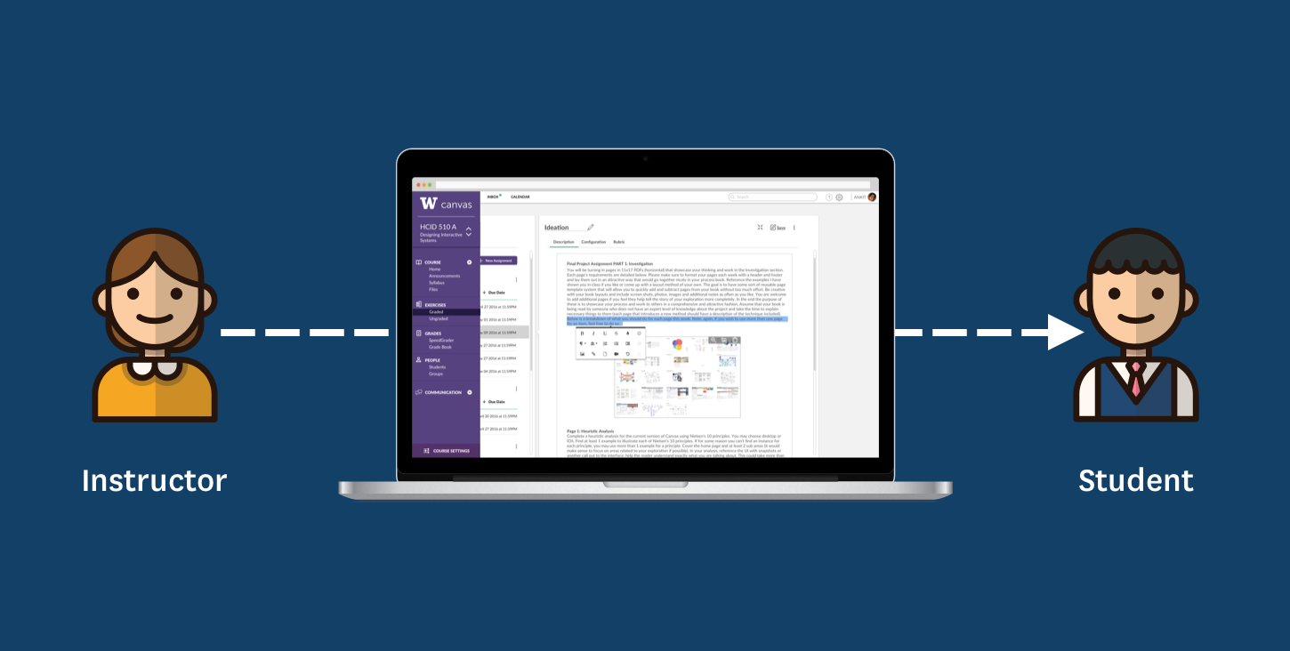
Canvas is a popular learning management system used by educational institutions. Designed around students, instructor's experience is left out. I redesigned the instructor's module with better navigation and features improving instructor's confidence over the system.
Goal
How can we improve teacher’s experience of using Canvas to better administer course curriculum at the University of Washington?
Teaching staff is responsible for creating and administering curriculum through Canvas. Canvas’s teaching module enables instructors to better create interactive curriculum, monitor class performance, communicate with students individually and provide timely and interactive feedback.
Shortcomings from teachers ability to use Canvas directly hinder student learning experience. Improvement on teacher’s side of using Canvas directly translates to a better student experience.
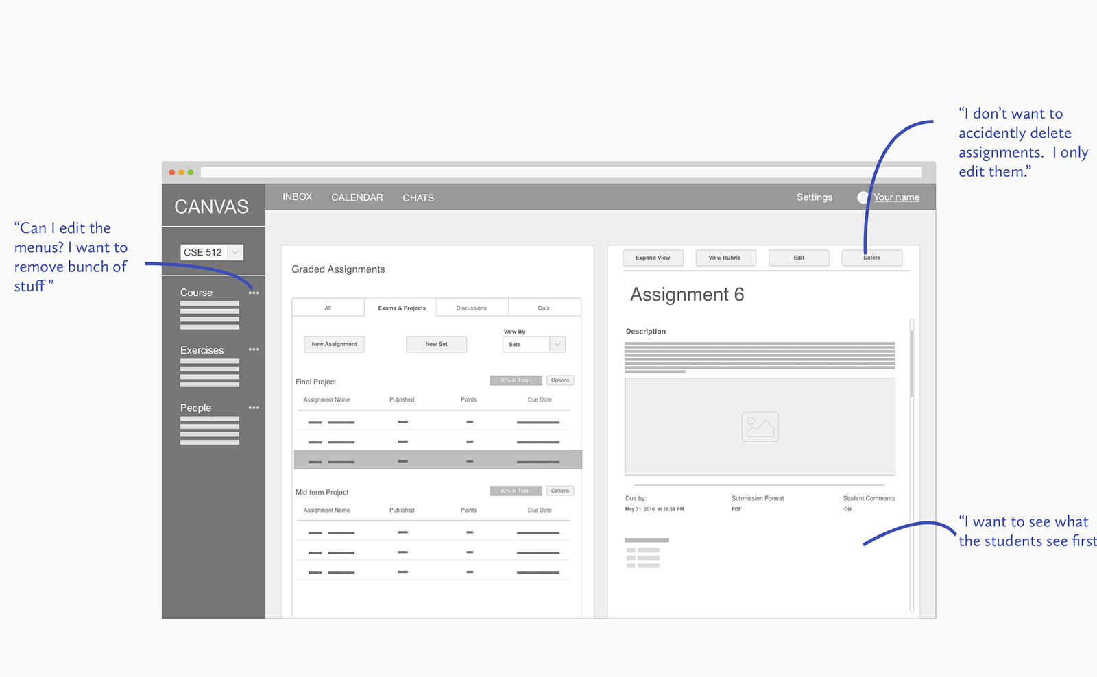
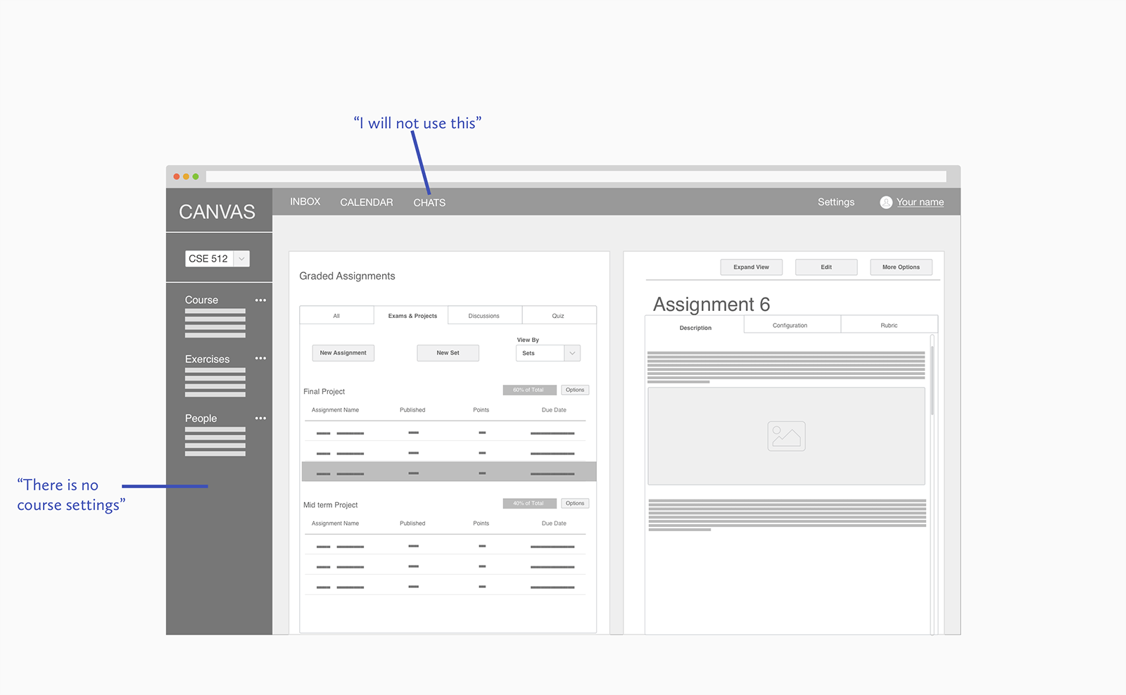
User Research
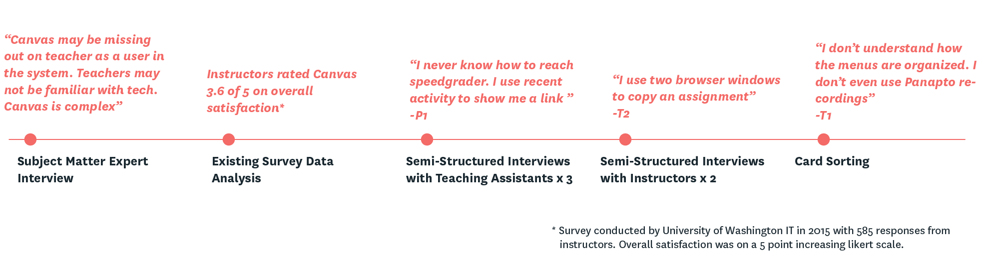
Through user research I wanted to understand the different roles, context and frustrations of instructors when doing various tasks on Canvas.
After analyzing the qualitative data, I found three top requirements for redesign
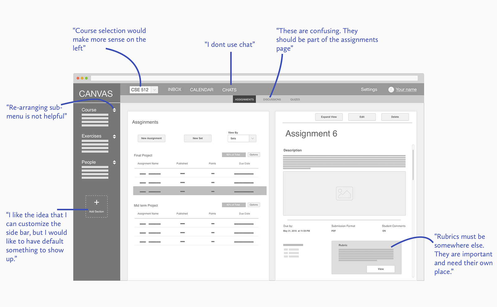
- Navigational Awareness
- Customizability
- System Visibility
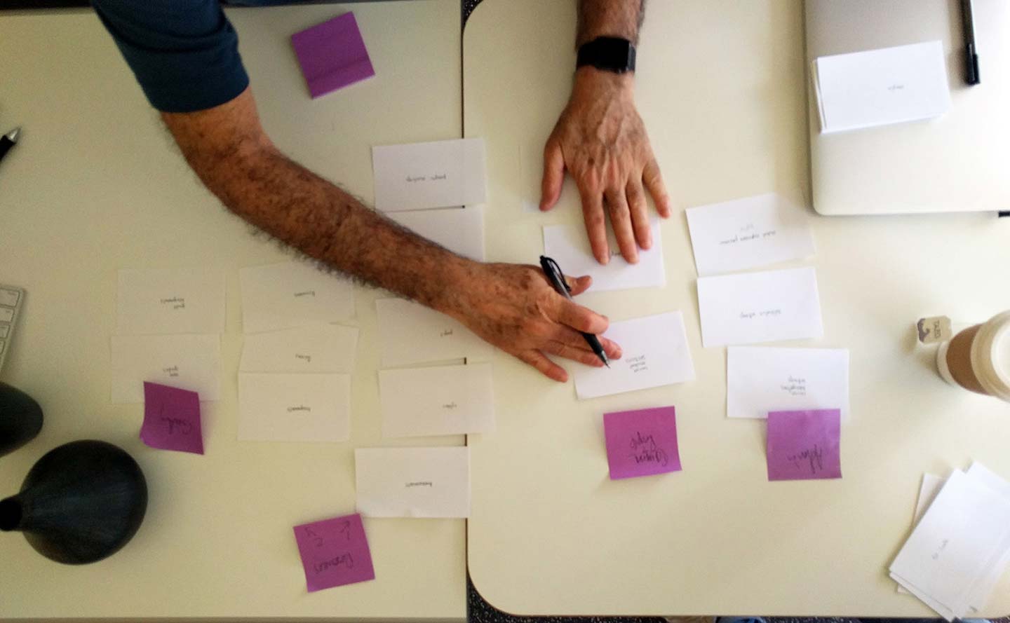
Ideation
Working within constraints
The interview with the Subject matter expert helped me in identifying hard constraints for the redesign to be successful. Canvas is a platform as a service with the platform provided by Instructure. UW-IT works with Instructure for theming and making customized modules. New features are heavily dependent on the larger Instructure platform, but theming is easy and within the bounds of UW-IT. This meant solving for my user problems while maintaining the internal information representation.
Mindmaps
Mind map is a personal exercise to help unravel any hidden but relevant connections around the product.

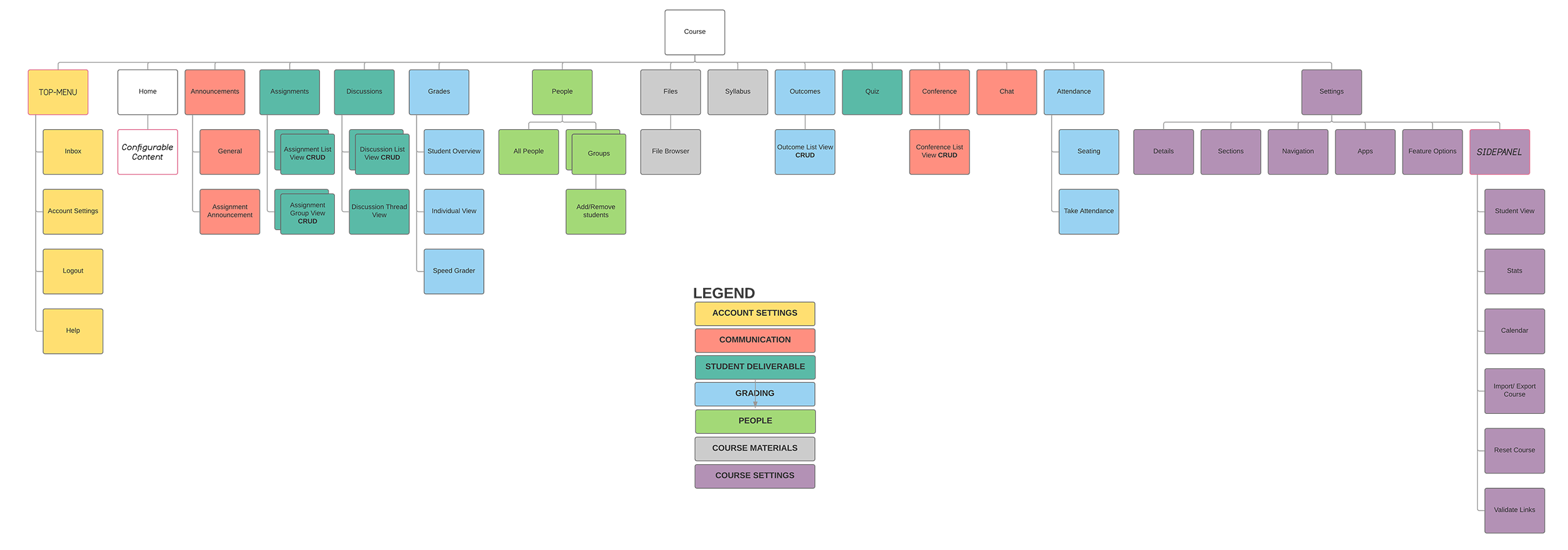
Sitemap
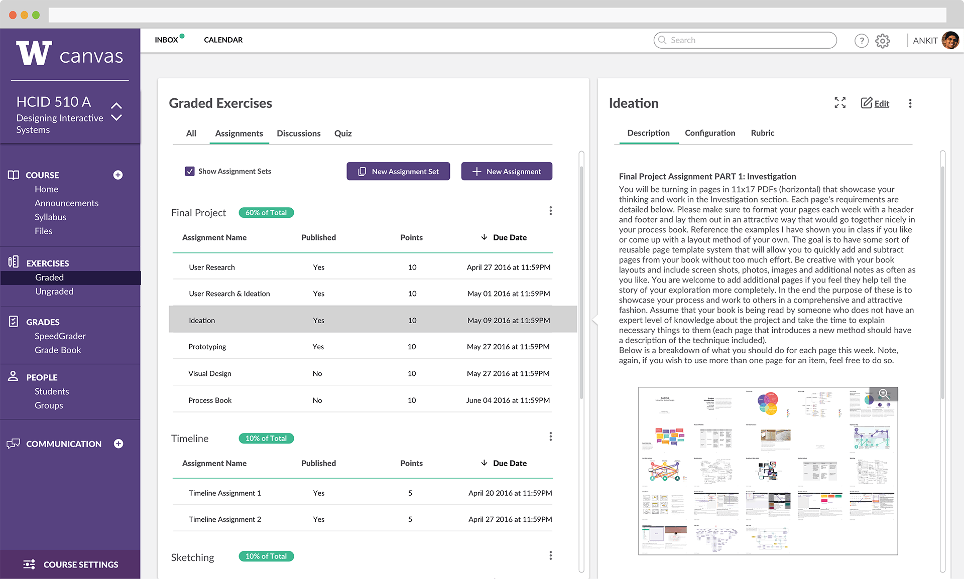
I made sitemap to understand and improve navigational awareness. Canvas has extremely flat organization of content and scattered grouping. There is a scope to group some headings into one, while still maintaining an almost flat hierarchy. A bit more nesting to the existing flat hierarchy will still enable faster navigation while reducing clutter.
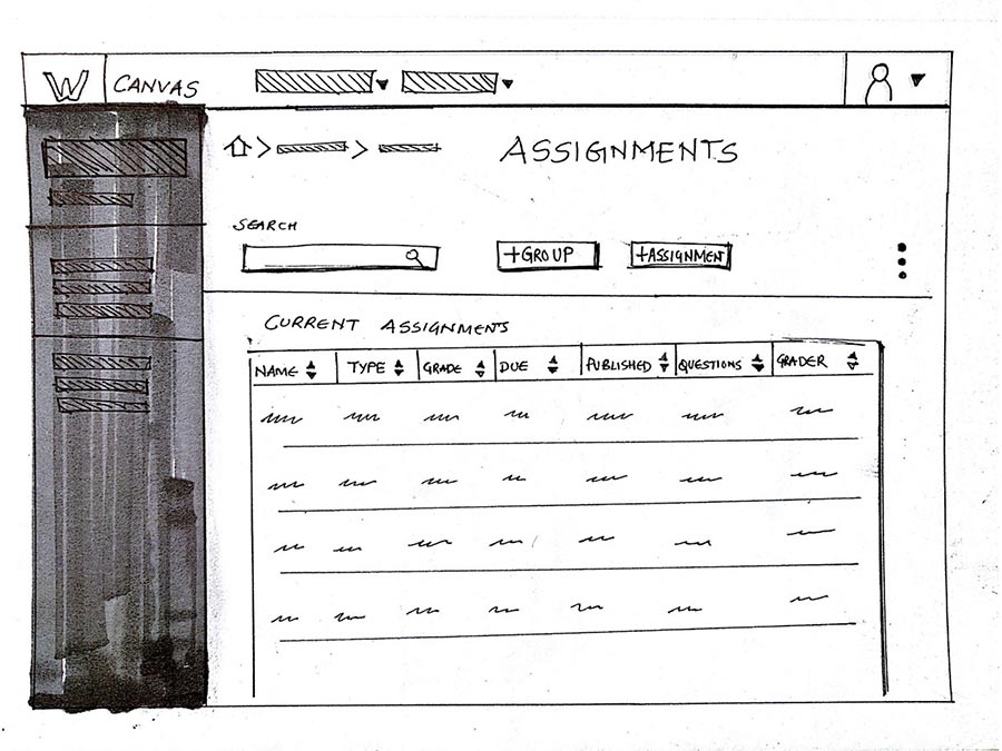
Broad UI directions
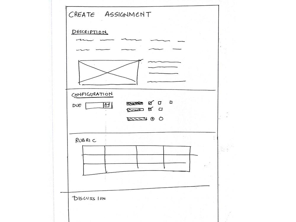
As broad ideation I quickly looked into conventional interaction styles used to make long forms and sketched out how would it fit in canvas assignment page.
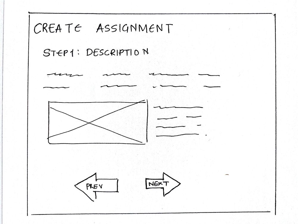
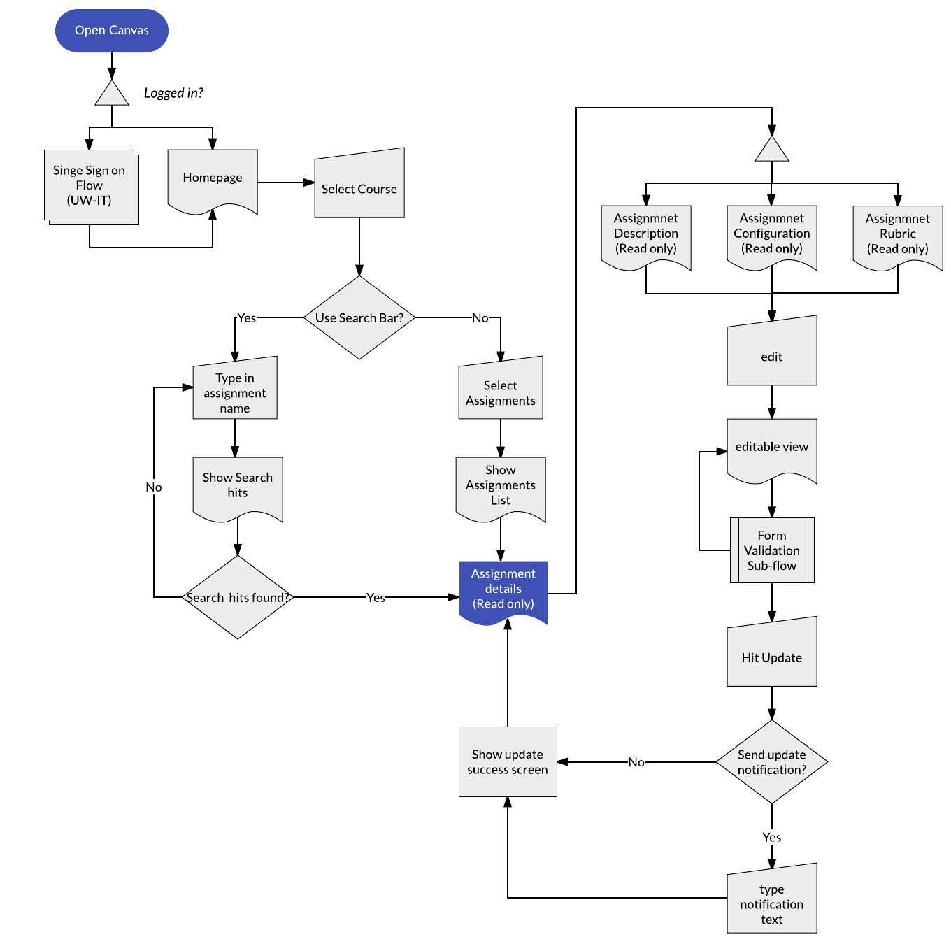
User Flow
A simple user flow to update existing assignment.
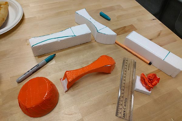
Prototyping
Iterating quickly
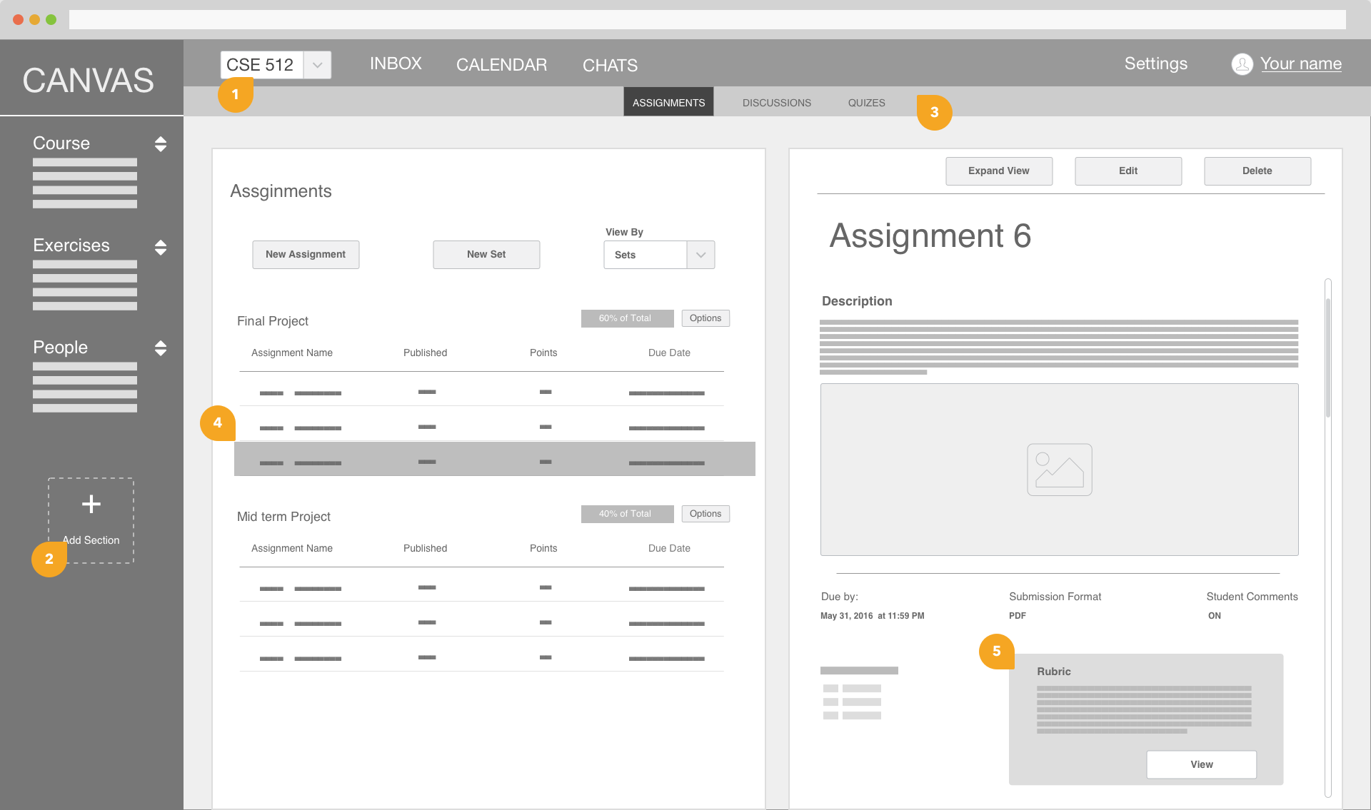
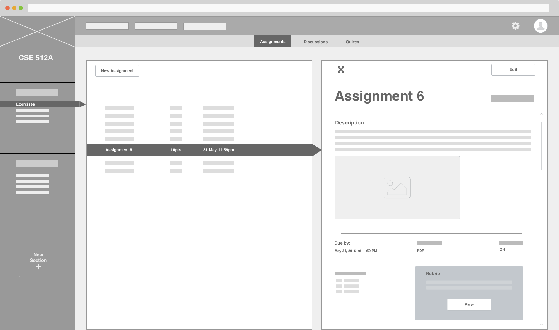
I worked through multiple iterations of my design from pen and paper to clickable prototypes in InVision. Moving quickly and testing throughout the process, I improved my designs in each iteration.
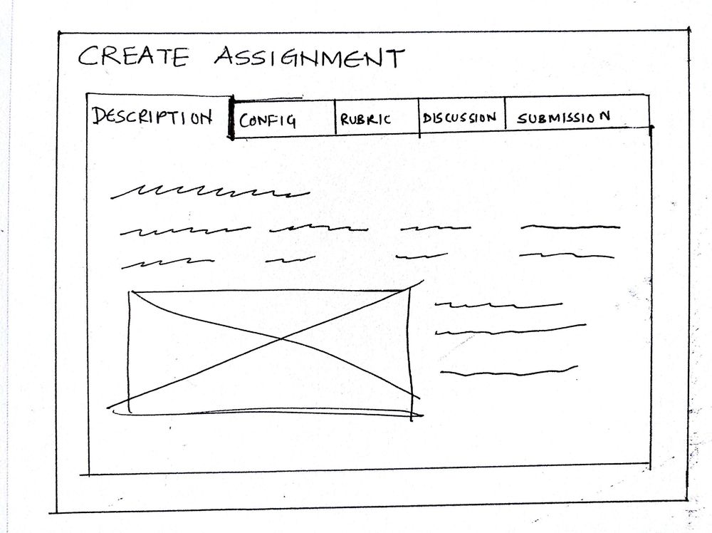
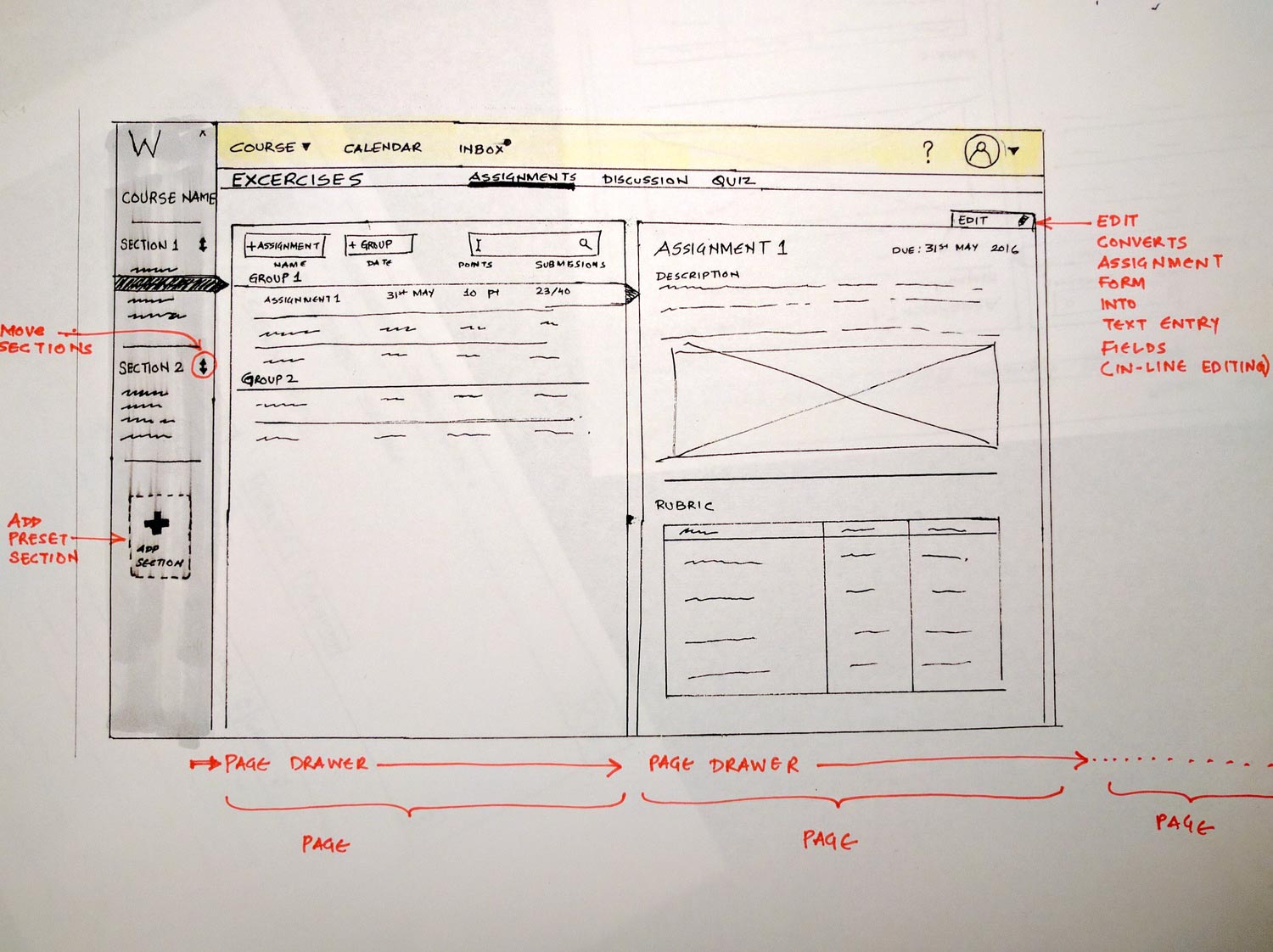
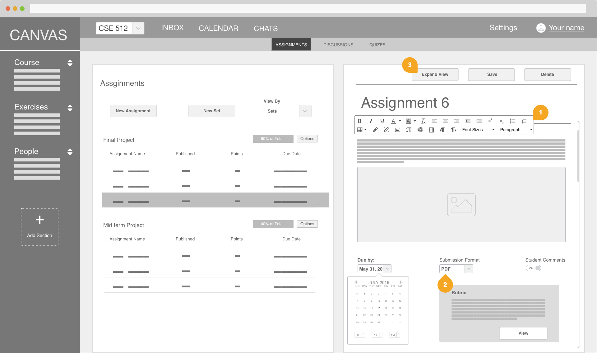
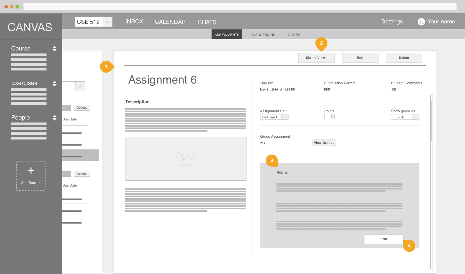
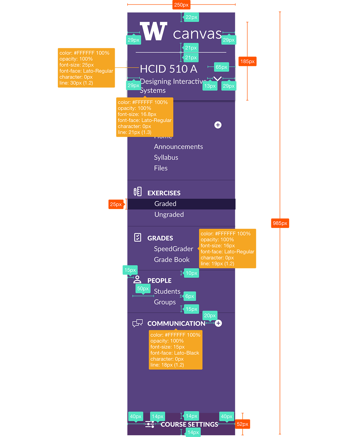
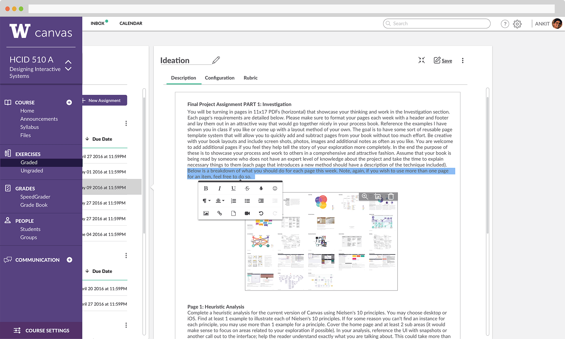
New Interaction Style
I proposed an information layout and interaction style of sliding pages which would provide better navigational context to the user and provide higher visibility of where they are within the system.
Wireframes
Before creating high-fidelity prototypes, I made wireframes and tested them with instructors to find common usability issues with the new interaction style.
User Tests
I made a small test guide with specific tasks to complete which were concluded by general questions. I did rapid iterations between tests and updated my concepts on the fly as I got feedback on various layout design for each screen of the wireframe.
Visual Design
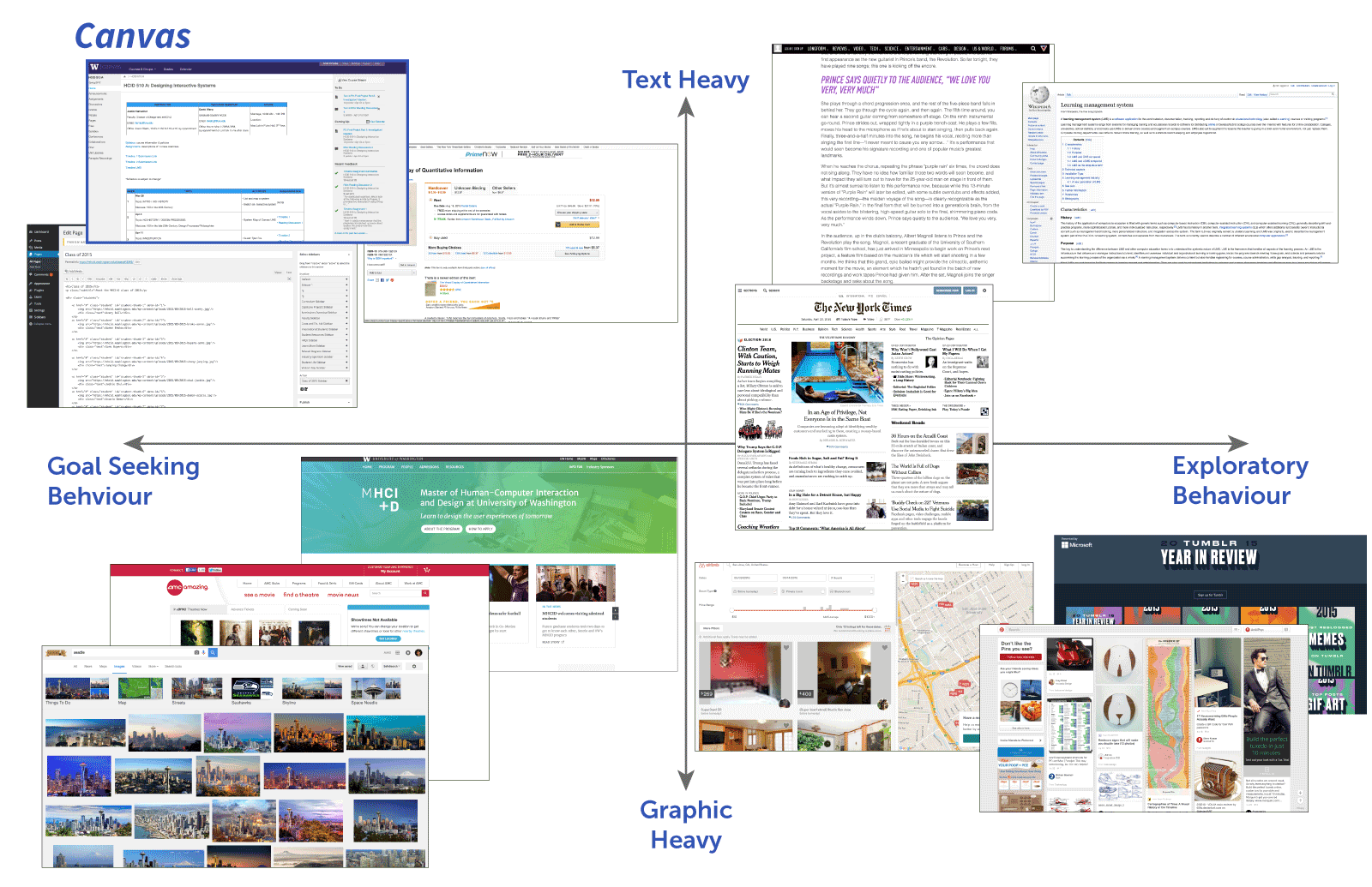
Finding a playful visual style
Through my visual design, I wanted to bring a playful and approachable look to Canvas. I set out to understand what makes an interface feel fun to use including color, typography, and icons. I tried to bring this visual aesthetic to my solution.
Style Matrix
Style Matrix helps in deciding how canvas should look visually overall. Instructors like the current highly dense layout. Instructors and students both also are trying to accomplish a specific task whenever they use Canvas. A cleaner but dense layout is desired.
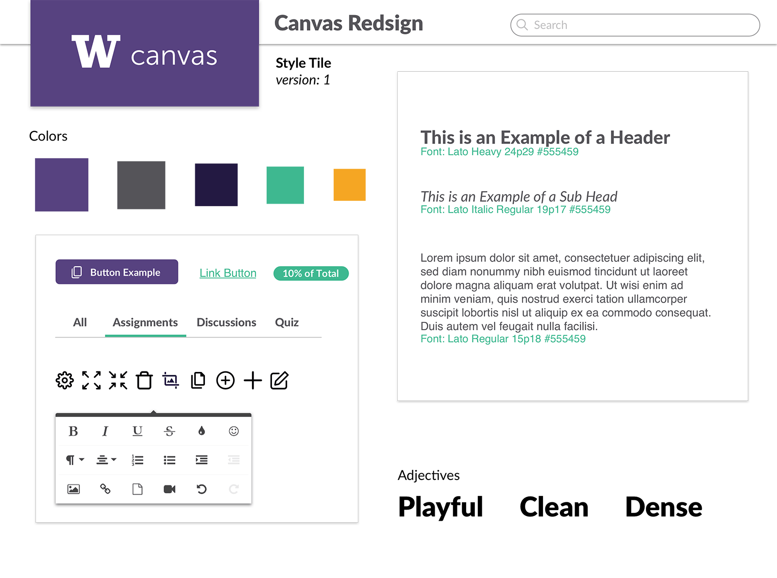
Style Tile
I use style tiles as a precursor for style guide. It provides a quick reference to decide how the visual design should look like. It is especially useful when adding a new UI component in existing widget set.
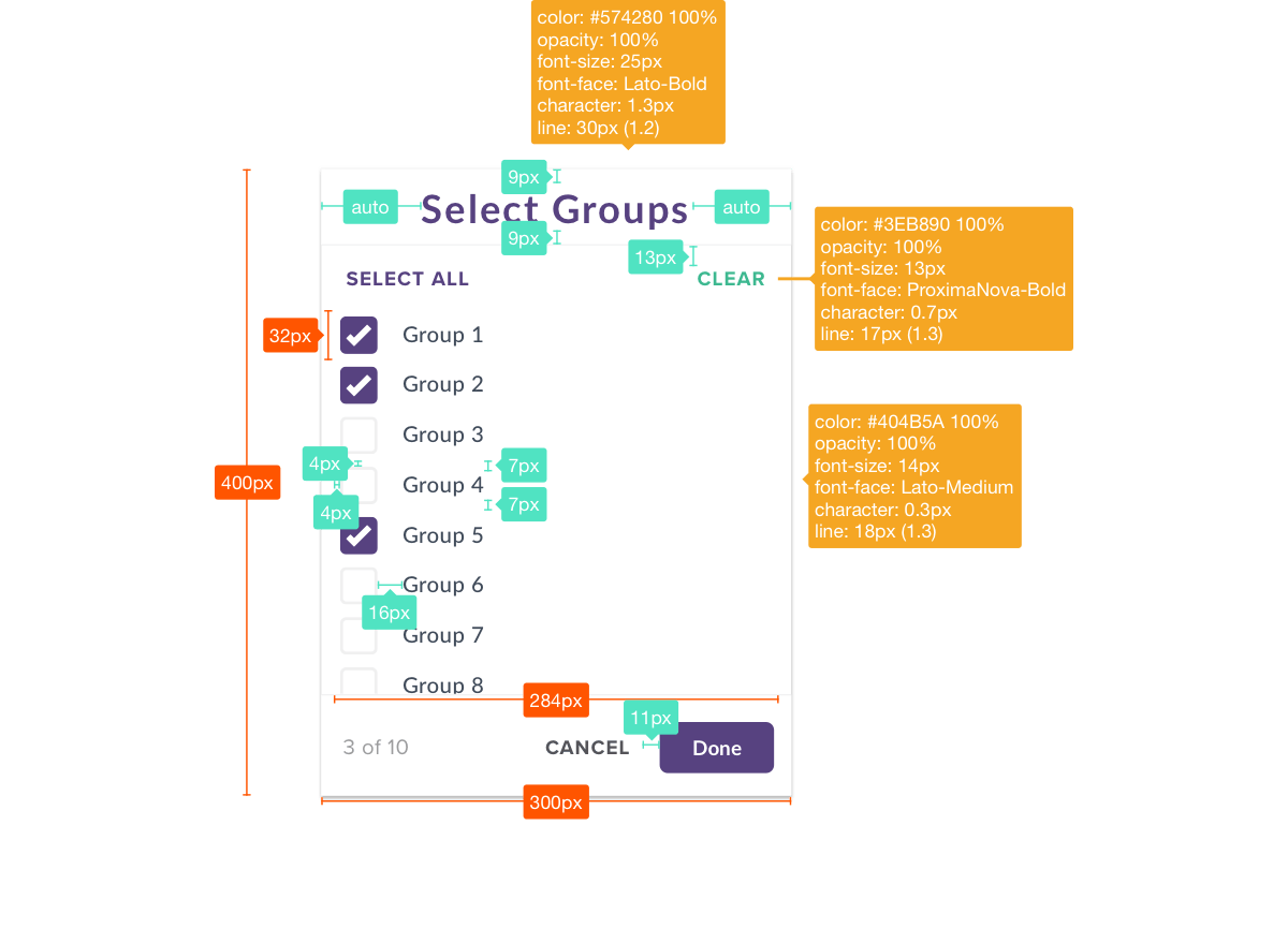
Redlining
Creating specs for various components.
Future Directions
Rethinking student experience
I worked on the instructor’s module of Canvas. The biggest user-base are the students and while designing I was mindful of this. Most of the visual design can be translated for student’s module. But the layout and fundamental information architecture need to be actively researched. My next steps would be to research students as my users before undertaking a redesign of student’s module.
Other Projects
product
01
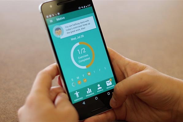
Helping physical therapy patients adhere to their exercise regimen
view solution
web-app
02
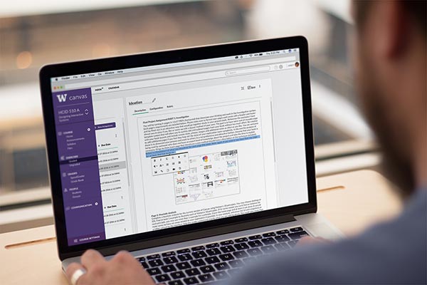
Helping instructors deliver better eLearning experience
view solution
Visualization Standards
03
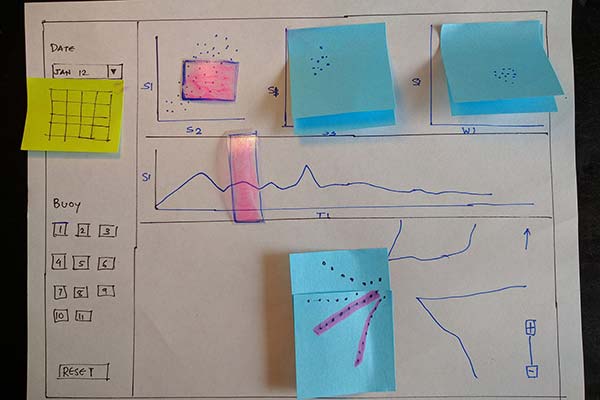
Helping oceanographers build visualization standards
view solution
Physical Computing
04
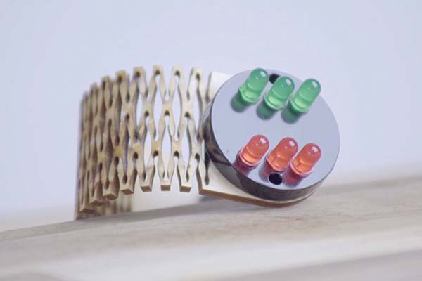
An intelligent device to monitor healthy backpack use
view solution
Prototyping
05